
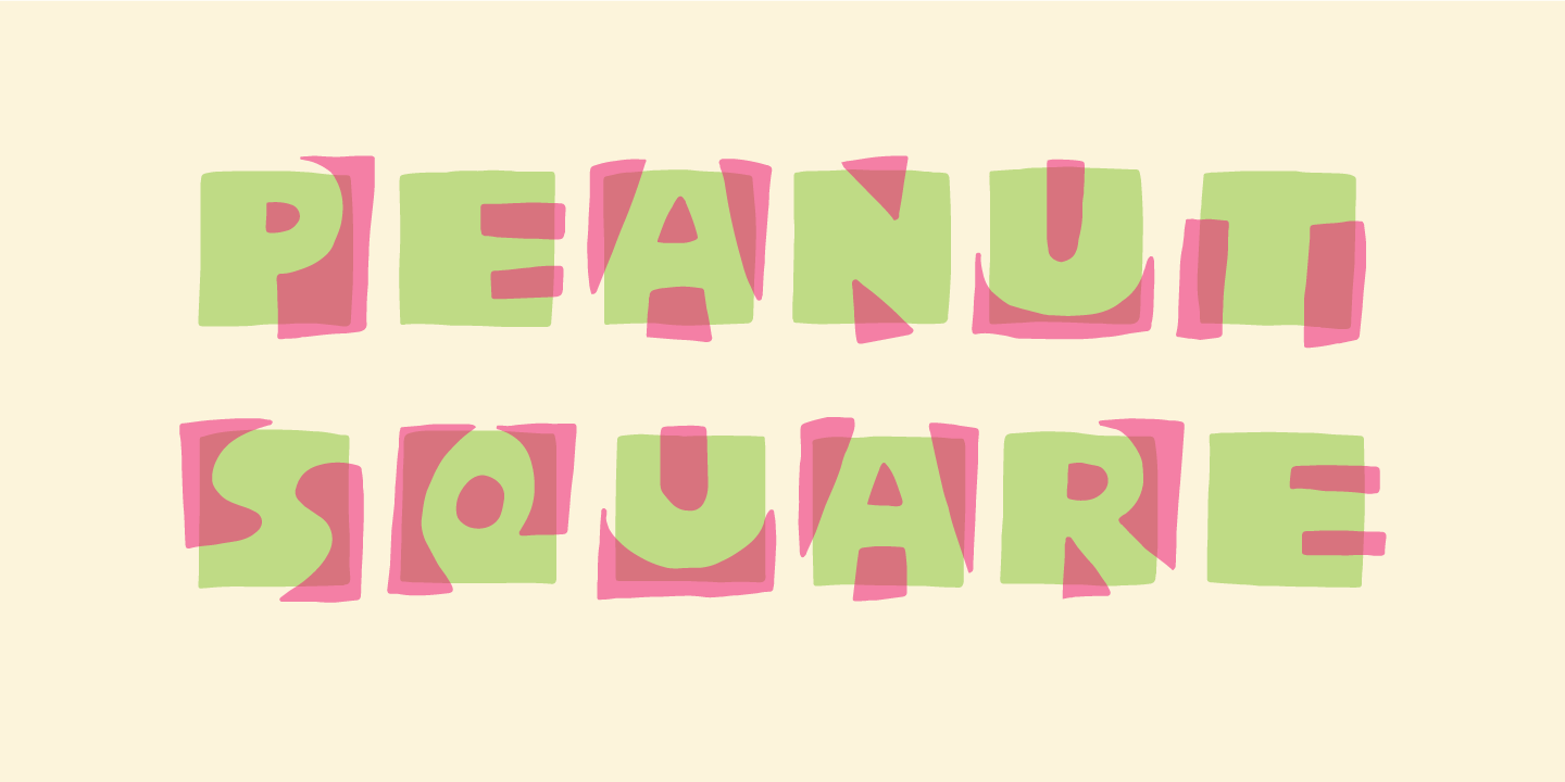

PEANUT SQUARE
This is a font that will fit in the “hard to read section” because it may not be super legible at first sight - that is because of the negative space. But when you combine the two layers (Layer and Box) the letter suddenly appears very legible!
